Wednesday, November 30, 2011

All about Pinterest

When I first came across Pinterest, to say I was underwhelmed was a bit of an understatement. It seemed like yet another thing to add to the must-have-if-you're-serious-about-your-online-presence....and all too much like hard work. But then, I spent a bit of time navigating through and found that, regardless of what it was originally designed for, it's an absolutely brilliant way of collating and storing all of those inspiration pics - and even better, it links to where they were found. In other words, it's amazing. So now I'm hooked, and there's so much fabulousness on there, I can't begin to tell you. So I'll just show you. Much better that way.


Just a few from my boards


But don't take my word for it. Check it out for yourself. Head on over and check out my pins, and from there, who know's what you'll find. But be warned....it's a little addictive. Ok, a lot addictive. But do it anyway....you know you want to.

Monday, November 28, 2011

Pretty pink posy

Heads up people - I've just added a new painting to my Etsy store! And if you're speedy, you can still snap up a 20% discount, just by entering the code NOVEMBER2011 at checkout. Here's the new kid on the block:

'Hydrangeas in Blue Vase'
fine art print
prints available in two sizes - 8x10 here, and 11x14 here

I'm off to see my besties at the post office now - for the second time today. But after that I have a date with my pool - can't stand watching the crew taunt me for a second longer. Hope you're all whoopin' it up too, wherever you are :)

Catch you soon,

Tuesday, November 22, 2011

Can't sleep? Paint!

It's funny how a break in routine can spark a frenzy of activity. You see, one of my babies is off at schoolies this week. For those who aren't familiar with schoolies, it marks the celebration of the end of high school for thousands of Aussie teenagers - I'm guessing it's probably similar to Spring Break in the US? Anyway, it means hoards of kids head off, often to the Gold Coast in Queensland, for a week of non-stop partying. What that also means is a week of no sleep and endless worry for the parents.  And if I can't sleep anyway, I need to stay busy and painting for me is the ultimate stress-buster. Hence the flurry of new work - at least there's one upside to this whole situation. I'm still counting the days until my chicks are all back in the nest (four to go. And my chicks will cringe when they read this!), but until then, here's the latest - a long-overdue addition to my Martha Stewart series...oops, I mean blue and white series:

watercolour on paper
210mm x 297mm
original on hold, prints available here in my Etsy shop


So you can probably expect a few more pieces to emerge over the next few days, as well as quite a few commissions I have on the go. Nothing like keeping busy to take your mind off other things....well, almost :) Oh, and don't forget - you can get 20% off any print in my Etsy store - even these new ones!


Monday, November 21, 2011

It's SALE time - 20% off storewide in my Etsy shop!!!!


Yes, it's that time of year again! Time to thank you all for the absolutely amazing support you've shown over the past twelve months. It's been a fabulous year, more so than I could ever have imagined, and now it's my turn to give a little something back. For the next week only, my whole Etsy store is on sale! 20% off every print, every design and every colour. All you need to do is enter the code NOVEMBER2011 at checkout and your discount will be automatically applied - it's that easy. What's more, all prints will soon be available in two standard sizes - the usual 8x10, as well as 11x14 or approx A4 and A3). So if you've been thinking of buying some new artwork, now's the time!

Oh, and did I mention there are a few brand-spankin' new prints to choose from? I've just finished a new watercolour - say hello to 'Equinox Rising':


'Equinox Rising'
watercolor on paper
11" x 14"


 You can choose from my Sea Plant Series:

 This is the new Seaweed II in French Blue - just one of many sea plant paintings


here's how my Turquoise series looks en masse. I love how Lauren used the orange mats to make them pop - gorgeous! Image courtesy Porter Design Company of her room in the Stately Homes by the Sea Show House. Photo courtesy Peter Rymwid 


Maybe you'd like a butterfly or two?

available here and here

and of course, my blue and white series featured in Martha Stewart Living, bouquets in vintage china, interior portraits, abstracts.....the list goes on. I also have some new and exciting paintings still to come. For the latest in what's happening, you can 'like' my Facebook page, or follow me on Twitter - that way, you'll be the first to know!

Thanks again everyone, you're the best. Seriously. See you soon with some more holiday goodies...!

Wednesday, November 16, 2011

Artist Marcella Kaspar's Sydney home...an update

Regular readers of my blog may remember my previous posts (here and here) on the beautiful homes of Australian artist Marcella Kaspar and her builder husband, Mark Cooper. The first home has since been sold to design maven Maggie Tabberer, with the couple then going on to build an almost identical replica, albeit with a darker and moodier vibe. It's just been featured in Marie Claire Australia magazine, and I couldn't miss the chance to revisit it - it's one of my all-time faves.


Marcella's stunning peony painting has inspired me to paint my own version to hang above my bed - of course, pics will be shared soon.


One of my favourite elements of both homes is the frangipani outside the main bedroom. Another idea I've stolen for my place :)

Now, just in case you're like me and too much of a good thing is never enough, here's a little bit more...


inlay vanity and mirrors...straight to the 'dream house' file

Talented + stylish = a killer combination. Couldn't love this place any harder if I tried.


all images courtesy Simon Kenny, Content Agency via Marie Claire Australia magazine

Monday, November 14, 2011

Ali's gorgeous home (and my art!) in Australian Home Beautiful

One of the best things about blogging is connecting with lovely readers like Ali. Earlier this year, I sent some original paintings her way; she was adding the finishing touches to her new home in the NSW Southern Highlands - one of the loveliest places on earth. And what a beautiful home it is. Featured on The House of Turquoise blog, and now in the latest issue of Australian Home Beautiful,  I was thrilled when she contacted me to commission some original watercolours. Ali chose my Sea Coral in Ruby, and Sea Fan in Ruby to complement the lovely grey/blue in her bathroom....


Sea Coral in Ruby - in a floating frame to highlight the wall colour 
and Sea Fan in Ruby - available in my Etsy shop

...and I think it works beautifully.

A home as gorgeous as this was bound to attract attention, so it came as little surprise when Ali told me it was to be featured in Home Beautiful magazine. It was quite an impatient wait - the photo shoot took place early this year - but when you see the results I think you'll agree it was totally worth it.


the lovely Ali outside her equally lovely home...divine


Ali and her family have since moved on, and are enjoying an extended trip around Australia. But I'm guessing there'll be another beautiful home on the horizon when she returns...and I can't wait! Oh, and btw - Ali's sister Mel is of Georgica Pond fame - style obviously runs in the family.

Thanks so much Ali for the mention, and thanks too, Home Beautiful magazine - so chuffed!


images courtesy Ali, Home Beautiful magazine, and realestate.com.au

Friday, November 11, 2011

Some serious soul-searching...

I was discussing art with a client once, and I was showing her the different things I'd done in the past. There were huge abstracts and floral works on canvas, delicate watercolours on paper, graphic black and white pieces, and a few figurative bits and bobs. She commented that she'd never guess they were all done by the same artist. Which, if I'm honest, threw me a little bit. Did that mean I was too scattered in my approach? Did it all look a bit hit and miss? Should I work on developing a particular 'style' and stick with it? I'd never really though about it too much before, and had always just painted what I liked, whatever that may be. Which seems completely natural to me, but maybe that's not the best way to approach this business. I mulled it over for a while, trying to decide what to do.

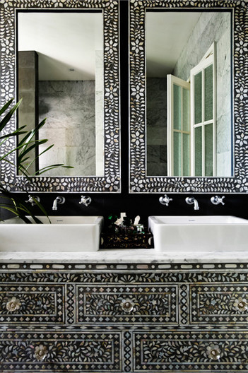
Then, a discussion with a friend put things in a whole new perspective. We both often joke that we really need a good half-dozen houses, just so we can decorate them in all the styles we like. Breezy and beachy, clean and modern, heritage, country....they all hold a certain appeal, and I could quite happily live in my version of any one of them. So why not art? Who's to say I need to stick to one style - surely there are no rules? I like to rotate my paintings with the seasons; darker, moodier pieces for winter, fresh and bright for summer. And why not combine lots of styles into one glorious mish-mash? I decided to go in search of the best examples of this approach, and think these pics prove without a doubt that 'eclectic', although done to death, really is rather fabulous when done right.


So, I'd love to hear what you think? And if anyone is a marketing-guru extraordinaire, then I'd also love your thoughts from a business perspective. But at the end of the day, I am who I am, and this is how I work.

Thanks guys, you're the best. Hit me with your best advice...I'm ready.


sorry, but lots of these images were saved ages ago...long before I was savvy enough to record the source. I know a few are courtesy of Lonny and Rue magazines, and some via realestate.com.au. If anyone knows more, please let me know and I'll credit accordingly. Thanks!

Thursday, November 10, 2011

New in Blue

I know I've said it a million times before, but I just can't go past the classic blue and white combo. Beachy or traditional, dramatic or dreamy, there's a blue to suit every mood. I'm working on lots of new and exciting paintings, and first cab off the rank is a piece in a lovely new shade of blue - French blue to be exact. Here she is:


'Seaweed II in French Blue'
210mm x 297mm (8" x 11")


ooh, and look how lovely she looks in Sig Bergamin's stunning beach house (allow me a little creative licence, ok?)


 original photo of Sig Bergamin's work courtesy Elle Decor magazine


I've just about finished a large version of this piece in denim blue (actually, I think the denim would look even better in Sig's place!) and also, I have a raspberry version on order too.

Over the next couple of weeks, I have some really exciting new pieces to share with you all - some are new additions to my existing range...think more of my blue and white series, new sea corals, butterflies and feathers... and others are brand-spankin' new paintings in new styles and designs. Can't wait to share them with you all - of course, I'll reveal all as soon as they're ready.

Catch you soon,

LinkWithin

Related Posts with Thumbnails