Wednesday, August 31, 2011

Veranda's House of Windsor

I don't know about you, but I can't wait for the official unveiling of Windsor Smith's latest project. Windsor is one of my very favourite designers (and if you know me, that's a big call), and she's really outdone herself here. In conjunction with Veranda magazine, and assisted by a few of her fabulous designer friends, Windsor has designed the most amazing property - complete with designer stables, gravel entryway, master suite; the ultimate fantasy home. What I wouldn't give to have been there in person at the grand opening....but instead, I'll be content with living vicariously through those who were...


master suite


master bath/dressing room. 


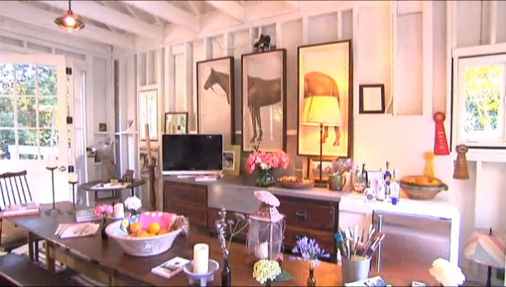
sensational eat-in kitchen


...and those stables - I could move in quite happily


Kathryn Ireland fabrics and design....love


his and her sinks

family room/den


it's all in the details

how's this for a nursery?


white, serene....and very relaxed for such a grand home


What I really love about this house is its relaxed feel. I know it's a luxurious, high-end designer home, but it really has warmth and charm. The emphasis is on family (ok, albeit a very well-off family), but nonetheless, I think that Windsor's vision of creating a home that brings people together has been achieved in spectacular fashion. The full reveal will feature in the October issue of Veranda magazine, but in the meantime, check out the website for a few snippets, and a look at the floorplan - love. You can also visit the blogs of those lucky enough to have seen it first-hand...beyond jealous.


Images courtesy of these very lucky bloggers:


http://www.cococozy.com/2011/07/house-of-windsor-spectacular-show-house.html
http://www.sabinavavra.com/uncategorized/house-of-windsor-part-1-of-2
http://caribbeanlivingblog.com/2011/07/27/sizzling-showhouse-%E2%80%93-house-of-windsor-part-2/

Monday, August 29, 2011

Custom prints....you choose the colour

Finding artwork to suit your style and colour scheme can be tricky. Often, you'll fall in love with a piece, but the colours don't work, or the size is wrong....you know how it goes. I've just finished some prints for a client, who requested I match them to a paint colour - Benjamin Moore Woodlawn Blue. Of course, the colours may not be exactly the same, but I have to say, I really like the way these have turned out....soft, pretty and in a lovely, green/blue hue:


'Sea Coral II in Woodlawn'


'Sea Coral IV'


'Sea Fan in Woodlawn'

Coincidentally, I was also commissioned to paint some of my ginger jars in a very similar colour, and it's a nice change, in place of the usual blue and white:


'Ginger Jar in Silver Sage'
210mm x 297mm (8" x 11")
prints for sale on Etsy


So, if you're looking for artwork, and you'd like to have a piece custom-designed in a particular colour or size, I'd love to hear from you.

Catch you soon,


Thursday, August 25, 2011

House of Turquoise feature

House of Turquoise is one of my daily must-reads. Without fail, Erin manages to find the most spectacular homes from around the world, and they all feature one of my very favourite colours - turquoise. So you can imagine my excitement this morning when I woke to find her latest post:

as seen in the Stately Homes by the Sea Designer Show House
room designed by the very talented Lauren Guarcello of Porter Design Company


Thanks so much Erin, you've made my day! You can see the whole post here.

Tuesday, August 23, 2011

Spring it on

It's cold and rainy here in Brisbane this morning, and just between you and me, I'm completely over winter. So, if I can't hurry Spring, I can at least indulge in a little virtual daydreaming, courtesy of Sig Bergamin.


I feel better already.....

Monday, August 15, 2011

Shut.The.Front.Door

I think the entrance to a home is really important - it can say a lot about the people who live there. Whether it sports a fire-engine red door, a gated courtyard, a shot of bright colour....first impressions count. While we work on our house plans, I'm thinking of giving our existing door a little makeover. It's solid timber, with glass sidelights, but it's really boring and badly in need of a spruce-up. But now, the million-dollar question....what colour to choose? So many colours....and only one front door.

 love this glossy black number, paired with the chrome doorknob

 Miles Redd's lovely turquoise door has been really popular for some time now. love the hardware and kickplate


 all white

 magenta maybe?

 really, really  love this pretty pink number...who would know what you'd find behind the door?


So, anyone gone all out with their front door? Tell me everything.

Friday, August 12, 2011

From the sublime, to the...well, you decide

Next time someone tells me to clam up, I'll take them literally. I've always loved the use of giant clam shells in decorating (as long as they're sustainably harvested, of course, or better still, fabulously faux), and I'm thinking I might need to incorporate a few into my design scheme.

Anna Spiro often uses shells in her lovely vignettes..

...and I love how Stuart Membery's used them for his gorgeous pooches...


..they look great as a centrepiece..


...in the bathroom...


...a summer fireplace...


...or glammed up with a little zebra print...

But I can't believe I've missed so many other fabulous uses! Of course, they're great for storing everything...

...from mermaids (note the ultra-comfortable, shag-pile interior)..


...to children...
...to champers.

But wait....how about making a grand entrance?


...for your next fancy dress party?


...or my all-time fave - the perfect place for a spot of planking?


LinkWithin

Related Posts with Thumbnails