Monday, August 30, 2010

Reader redesign....the power of white paint

Last week, I received a lovely email from one of my blog readers, Karen. Karen and her husband had a common problem with their home, and one that I'm all too familiar with - the dreaded pine ceiling and brick wall combo! Karen had seen the huge difference a coat of white paint had made to my kitchen and ceiling, and is also a fan of Millie and Moth's work over at The Laurel Hedge, and so decided a white wash was exactly what was needed to give her family room a lift. Take a look at the before...


...and the afters


Karen is far from finished with her makeover - there are new lamps and accessories still to come, and her husband is building a cabinet to disguise the fridge and provide more storage. And if the transformation isn't amazing enough on its own, amidst all the reno chaos Karen underwent two eye operations! What a wonderful job, and thanks must go to Karen and her husband for letting me share their makeover success with you all.

Hope you all had a fantastic weekend,

Thursday, August 26, 2010

An award...and an apology!

I have a huge apology to make...last month, the lovely Natasha from Northern Light was nice enough to pass on a the Versatile Blogger award to me, and somehow I managed to miss thanking her! So Natasha, thank you so much for the award, I really do appreciate it more than you know. For those of you who haven't met Natasha yet, she was born in East Africa, raised in Denmark and lives in America. Her blog is a treasure trove of all things beautiful, and is one of my daily reads. Here's a little of what you can expect:


So if you haven't already, pop on over here and check it out, you won't be disappointed. Oh, and say hi from me too! 


Wednesday, August 25, 2010

Kauri Cliffs

You may remember my post on Huka Lodge, with its gorgeous, stylish interiors. Well, Virgina Fisher, who was responsible for the design of Alan Pye Cottage, has also worked her magic on another gem called Kauri Cliffs. Overlooking New Zealand's Bay of Islands, the luxury resort ticks all the boxes - stunning location, beautiful design, and every luxury imaginable. 


all images courtesy kauricliffs.com


Stunning, isn't it? I've just spent the day at an athletics carnival, on a bitterly cold day, so this looks oh-so-appealing at the moment.

Hope you've all had a great day,

Tuesday, August 24, 2010

Oh my...

...is this not the best study ever? Just look at the library (bliss!), the vintage goodies, gorgeous floors....need I say more?


Ah, to dream.....

Monday, August 23, 2010

Blue cabinet...a little update

I know it's taken me absolutely ages to get back to this post, but better late than never I guess! Here are a few pics of my blue cabinet I posted about here - with a new coat of white paint and a few pretty vintage pieces to zhush it up a bit.


ok, and the before:


I only have this one photo to share today, as blogger and I are not on good terms - is anyone else having the same problem? I'm even struggling to log in at the moment. But anyway, I quickly popped some of my vintage pink china on the shelves, and thought the it looked rather pretty against the chippy, peely, aqua paintwork. You may remember my inspiration was the blue cupboard revamped by the lovely Maria over at Dreamy Whites :


gorgeous, no?


This cabinet will probably end up in my art studio, to hold all of my art supplies, but in the meantime I thought it might be fun to style the shelves in a few different ways - which I'll do over the next few weeks.

Ok, it's back to some real work for me, so I'll catch you all later.

Have a great day,


Friday, August 20, 2010

Drift II

Well, I promised a peek at one of my new paintings, so here it is. It's pouring here in Brisbane at the moment, and with my dinky camera I'm having a terrible time trying to get a decent photo. I'm working on some new mixed-media works for my 'Drift' series, along with some different colourways, so when the weather clears I'll try to get some half decent shots!


With summer on its way, many of my recent works feature blues, greens, greys and whites - can you tell that I'm tired of winter and can't wait for the warmer weather to arrive?  Here are a few pictures from my inspiration board at the moment:


from here


domino magazine


remember the beach house makeover? It's still in progress, but with views like this, it's pretty hard to go wrong


courtesy phoebe howard

I'll be back soon with some better pics...promise!


Thursday, August 19, 2010

Synchronicity...

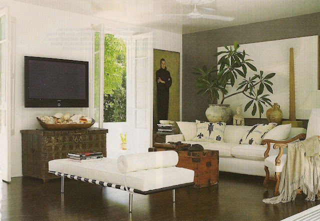
As a side note to my last post, featuring Maggie Tabberer's new home, I thought I'd let you know that the fabulous girls over at Desire to Inspire have just featured Pam Makin of Les Interieurs - the designer behind Maggie's makover. Her style is an upmarket take on beach living, with "...tribal artifacts, the smooth concrete floors, large striking artwork, views forever and natural textures including beautiful aged timbers teamed with cottons and linens". Take a look:

another view of Maggie's living area


Pam's own home has been featured in many a magazine

So if you want to see more, pop on over to Desire to Inspire and check out their post - it's fantastic as always. I'll be back soon with a sneak peek of a new painting - if I can get five minutes to finish it!

Enjoy your day,


Tuesday, August 17, 2010

One gorgeous home...two ways

Over the past few weeks I've been trying (rather unsuccessfully I might add) to cull some of my stash of magazines, and in the process I found these pics of one of my favourite homes. This house originally belonged to artist Marcella Kaspar and her builder/designer husband Mark Cooper, and was featured in Vogue Living magazine. I loved it from the outset, with its beautiful old frangipani and Marcella's stunning artwork:


what a way to wake up every morning

stunning seascpes take centre stage in the main living area


the curtains are divine, as are Marcella's signature peony paintings


Fast forward a few years, and fashion icon Maggie Tabberer is the new owner, making a few changes in the decor department:


Maggie enlisted friend Pam Makin of Les Interieurs to collaborate on the new interior design scheme


Maggie's style is a little more 'designed' perhaps?


new artwork, bedside tables and curtains in the main bedroom


So, I'd love to know what you think - which style do you prefer? Honestly, I'd be more than happy with either!


images 1-5 photography Simon Kenny, content agency and Vogue Living magazine
images 6-11 photography Michelle Holden via Australian Womens Weekly

LinkWithin

Related Posts with Thumbnails