'Calypso I'
mixed media on canvas
12" x 12" (30cm x 30cm)
tangerine and hot pink - always a killer combo
SOLD
I'll be adding some smaller originals on canvas to my Etsy store in the new year, but if anyone is looking for pieces in time for Christmas, this and its friend (it's part of a small diptych, but is also designed to stand alone) are available now. Feel free to email me if you'd like more information.
I've also just used this fabric for a client in the pink colourway, and paired it with shades of green and aqua - very fresh and summery. But it looks equally lovely in tangy tangerine...
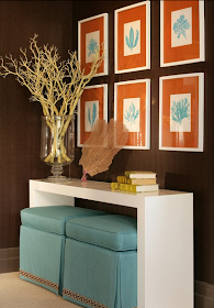
Orange works wonderfully with turquoise too. You may remember how Lauren from Porter Design Company framed my turquoise sea plant paintings with vivid tangerine orange mats for her room in the Stately Homes by the Sea Showhouse:
...and maybe I was ahead of my time - earlier this year, I released a number of my prints in...wait, that's right....Tangerine!
Prints are all available here in my Etsy store.
I think it would make a great addition to any holiday table - even this snippet really makes an impact:
..and packs quite a punch in these vibrant bedrooms:
So, are you loving Tangerine Tango, or, like my mum, do you absolutely hate it? Did Pantone get it right? Love to know what you think.


I think you already know my thoughts on orange/tangerine/mandarine etc and pink. A match made in arty heaven : )
ReplyDeleteOhhh yes! We love this combination and will actually be introducing it in our new collection next year. Love it and love the painting!!
ReplyDeleteM & E xo
Before seeing some of these images I would have said that it's not a colour that I would usually be drawn to. However, teamed with the blue it actually looks quite striking.
ReplyDeletex
It is such a great colour and your painting is fabulous Kerri!
ReplyDeleteAbbey x
The only problem Kerri, is who wants to look like a Pantone lemming? I wish they'd let us decide for ourselves!
ReplyDeleteHi Kerri,
ReplyDeleteI love your painting. The colours are fantastic!
So pretty and happy. And you did a great job on your clients place.
I loved your painting so much I pinned it on my pinterest board. Am going to check out the rest of your work. You are very talented.
:)
mikky
www.todaloos.com
LOVE that canvas Kerri, absolutely stunning! I've been sitting here trying to figure out where i could put it in my house ;) LOL
ReplyDeleteI love it and your tangerine prints are wonderful!!
ReplyDeleteI could definitely do some of this, blended with other colors - I love the energy of it!
ReplyDeleteI think it's fab when used in moderation and as a removeable accessory. Do love that pink Thibaut wallpaper with the tangerine, stunning.
ReplyDeleteI love it, Kerri!
ReplyDeleteHappy Holidays and thanks for stopping by my blog.
Love these pics, we're a fan!
ReplyDeletehow can we purchase the fabric in the first bedroom picture (pink fabric on walls matching pillows on bed)? THank you.
ReplyDelete