Does it get much better? I think not.
If you're as besotted as I am, you can choose from one of twenty five standard colours, or maybe have one of the La Cornue artisans create something just for you. Oh, and did I mention they'll also colour-coordinate your other appliances too? All the good stuff here.
Friday, July 29, 2011
Thursday, July 28, 2011
Curiosity Shop
It probably comes as no surprise that I love vintage books. My favourites are those on natural history, and I love scouring dusty old bookshops for these treasures. And I guess it's a natural progression that some of my favourite painting subjects come from nature. I'm preparing for a solo exhibition later this year (very exciting! I'll share all the deets soon) and now that I'm almost rid of this rotten flu (three weeks and counting) I've been experimenting with some new ideas. Here's a look at a little watercolour study I've just finished:
This is the first in a new series, and there are lots more to come. The colours are so gorgeous, and as well as these beautiful blues, there will be vibrant yellows, oranges, black and white - something for everyone. To me, these look best en mass, and I'll be framing the originals with simple, streamlined black frames to really make the colours pop. There are quite a few surprises that I'll reveal closer to the exhibition date (think big, bold and beautiful!), so if you'd like me to add you to my mailing list, drop me a line or message me, and you'll be the first to know.
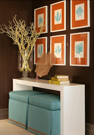
I've found a few pretty pics to give you an idea of how you can use paintings like these to make a real statement.
Thanks for everyone who emailed over the past few weeks - I'm back in the land of the living again, and I really appreciate your concern. On track again and looking forward to getting stuck in to some new projects - can't wait!
This is the first in a new series, and there are lots more to come. The colours are so gorgeous, and as well as these beautiful blues, there will be vibrant yellows, oranges, black and white - something for everyone. To me, these look best en mass, and I'll be framing the originals with simple, streamlined black frames to really make the colours pop. There are quite a few surprises that I'll reveal closer to the exhibition date (think big, bold and beautiful!), so if you'd like me to add you to my mailing list, drop me a line or message me, and you'll be the first to know.
I've found a few pretty pics to give you an idea of how you can use paintings like these to make a real statement.
via decor8 - so pretty
source
more restrained and curated
via my good friend Martha....and look, there are some feathers too.
Now I realise these aren't butterflies, but the repetition and symmetry is what really works here, and those prints could be any subject - botanical, sea plants, specimens....you get my drift. By Stephen Gambrel
Thanks for everyone who emailed over the past few weeks - I'm back in the land of the living again, and I really appreciate your concern. On track again and looking forward to getting stuck in to some new projects - can't wait!
Thursday, July 14, 2011
Black + White
I've been laid low with the dreaded lurgy for the past couple of weeks, which, as well as being totally inconvenient, has meant that I've had little energy for anything other than coughing and spluttering (and, if you ask the clan, they'd probably add whingeing as well). But I digress. One good thing that's come from my convalescence is that I managed to find the designer behind a room I've had saved in my files for ages.
I had a lovely message from Brissie designer and fellow blogger Daryl Wark, which in turn led me to his gorgeous blog. As I settled in for a good read, I came across this post on South African designer John Jacob Zwiegelaar (which, coincidentally, Daryl found through Judy at Verandah House), and there was the black and white room I'd had saved for ages. Even better, it lead to this website, which was full of stunning, black & white interiors.
What I love about a black and white (and neutral) scheme is that you can always throw in some colour when you feel like a change, or go completely monochromatic - the options are endless. Take this last room - it would look equally great with some mismatched cushions, an abstract painting or two, and a few bright accessories. I love colour, but my fickle nature means I always stick to a neutral scheme for the bones of a room, and add pops of colour with pieces that can be changed quickly, and relatively inexpensively - artwork etc. Thanks Daryl for the heads up, and seriously, do yourself a favour - head on over to Daryl's blog - lots of goodies there, let me tell you. My fave post - how to keep your vintage Louis Vuitton looking great...but not too 'new'. Fabulous to the max.
I had a lovely message from Brissie designer and fellow blogger Daryl Wark, which in turn led me to his gorgeous blog. As I settled in for a good read, I came across this post on South African designer John Jacob Zwiegelaar (which, coincidentally, Daryl found through Judy at Verandah House), and there was the black and white room I'd had saved for ages. Even better, it lead to this website, which was full of stunning, black & white interiors.
love
even the pooch is colour matched
all images via John Jacob Interiors
What I love about a black and white (and neutral) scheme is that you can always throw in some colour when you feel like a change, or go completely monochromatic - the options are endless. Take this last room - it would look equally great with some mismatched cushions, an abstract painting or two, and a few bright accessories. I love colour, but my fickle nature means I always stick to a neutral scheme for the bones of a room, and add pops of colour with pieces that can be changed quickly, and relatively inexpensively - artwork etc. Thanks Daryl for the heads up, and seriously, do yourself a favour - head on over to Daryl's blog - lots of goodies there, let me tell you. My fave post - how to keep your vintage Louis Vuitton looking great...but not too 'new'. Fabulous to the max.
Friday, July 8, 2011
Stately Homes by the Sea - the room reveal at last!
Back in May, I posted about the Stately Homes by the Sea Showhouse. At last, I can now show you photos of the room that Lauren Guarcello of Porter Design Company put together, and what a job she's done. Lauren commissioned me to paint a series of watercolours in vibrant turquoise to complement her scheme, and I think the results speak for themselves.
Lauren has done an amazing job, and I've heard a whisper that this room will soon be featured in a magazine spread. Talented and an absolute pleasure to work with - my favourite combination! You can see more of Lauren's work on her website, and she now has a Facebook page as well, so pop on in and say hi from me.
Hope you're all having a great week - I'm enjoying the school holidays way too much as always. They're never long enough for me, so I'm making the most of it before we get back to business next week. Catch you soon,
I love Lauren's use of orange - it really makes the turquoise pop
photos courtesy Peter Rymwid
design by Lauren Guarcello, Porter Design Company
Lauren has done an amazing job, and I've heard a whisper that this room will soon be featured in a magazine spread. Talented and an absolute pleasure to work with - my favourite combination! You can see more of Lauren's work on her website, and she now has a Facebook page as well, so pop on in and say hi from me.
Hope you're all having a great week - I'm enjoying the school holidays way too much as always. They're never long enough for me, so I'm making the most of it before we get back to business next week. Catch you soon,
Thursday, July 7, 2011
Barnstormers
Ever since I saw this photo of Sharon and Ozzy Osbourne's new digs in Architectural Digest..
..I've been plotting how to incorporate some barn doors into my house. These are to.die.for. The colour, the detail, the exposed industrial runners....perfection. Here are a few more examples I've found..
image 2 source
image 3 source
image 4 source
image 5 source
image 6 source
loving these chalkboard versions - genius
crisp and clean
or a little more tailored
perfect for the home office
Hmm, looks like I'd better start looking for the perfect vintage doors now - I'm guessing they're few and far between. Or maybe I could just commission MLB to source them for me, a la the Osbournes?
image 2 source
image 3 source
image 4 source
image 5 source
image 6 source
Monday, July 4, 2011
One gorgeous home three ways...well almost
If you've been reading my blog for a while, you may remember this post, when I featured one of my favourite houses. It was originally built by artist Marcella Kaspar and her husband, Mark Cooper, and later sold to Maggie Tabberer. Well, Marcella and Mark have since built another home, with a similar floorplan, but this time they decided to change things up a little, and the results are just stunning.
And here are a few pics of the original house:
And again, with the Maggie T touch:
So, which do you prefer? Dark and moody, or bright and beautiful? I love nothing more than seeing a house like this, which has fabulous bones and great style, decorated so differently. Love to know what you think.
images 1-7 courtesy www.domain.com.au
images 8-10 photography Simon Kenny, via content agency and Vogue Living magazine
images 11-15 photography Michelle Holden via Australian Womens Weekly
And here are a few pics of the original house:
And again, with the Maggie T touch:
images 1-7 courtesy www.domain.com.au
images 8-10 photography Simon Kenny, via content agency and Vogue Living magazine
images 11-15 photography Michelle Holden via Australian Womens Weekly